General Tab Settings
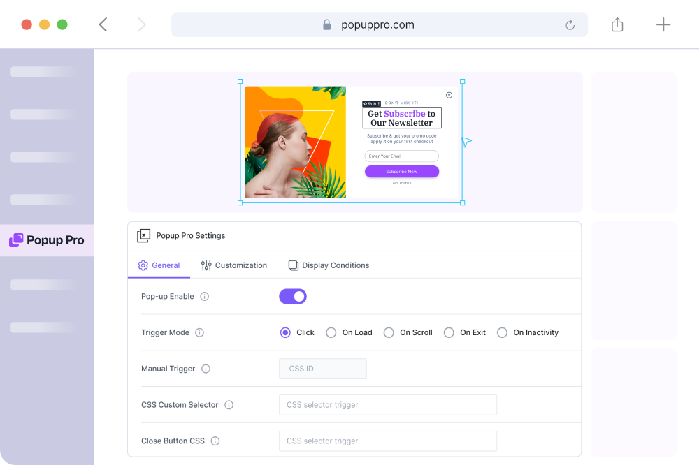
In Popup Pro Dashboard, you will find the following settings:
- Use Divi Builder – This will allow you to design your Popup using the Divi Builder.
- Popup Pro Settings – Here, you can configure and customize your Popup and publish for public appearance.
Active: This setting determines whether the Popup extension is active or inactive. Toggle this option to enable or disable the module.
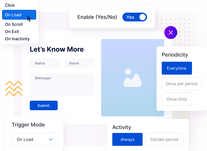
Trigger Mode: Trigger mode specifies the trigger mode for displaying Popups. Choose from available options, such as on-page load, on-click, or other trigger events.
On Page Load: For opening a pop up through page load, utilize the On Load trigger. It offers the delightful option of setting Start and End Delays. Start denotes when the popup opens, while End Delay (if specified) gracefully closes it after a specified time (in seconds).
On Scroll: Using this event you can show a Popup when a user scrolls a set distance, measured in pixels or a percentage. For example, if you set it to 250px, the Popup appears after the user scrolls down 250 pixels following the page load
On Exit: Drive higher conversion rates through the strategic use of Exit popups, skillfully created to connect with users right before they navigate away from your website.
On Inactivity: Utilize automated inactivity detection to convert your website visitors into subscribers. Configure the trigger to launch a Popup after a designated period of user inactivity, such as 15 seconds.
Manual Trigger: You can manually trigger popups using a CSS ID. This feature allows you to activate the Popup by using the specified CSS ID. You can use the default CSS ID which is generated for individual popups.
Custom CSS Selector: You can define custom CSS selectors to target specific elements for Popup activation. Specify CSS selectors (e.g., .popup-class, #pop-upid) to trigger popups.
Closing CSS Selector: This option specifies the CSS selector that will close the open Popup. Define the selector for elements that will close the currently displayed popup.
Remove Link: In this option, you can remove links from specific elements using a selector. Enter the selector to identify and remove links from elements within the Popup.

Close On Overlay Click: Here, you can use this option so that the Popup should close when users click on the background overlay. Toggle this option to enable or disable the ability to close the Popup by clicking outside the Popup area.
Clickable Under Overlay: This setting enables website elements to remain clickable when a Popup is open and displayed over them. Toggle this option to allow users to interact with elements beneath the overlay.
Prevent Page Scrolling: It prevents page scrolling, enable the “Prevent Page Scrolling” option.
Close By Clicking Back Button: Close the Popup when the browser or mobile back button is clicked, and activate the “Close By Clicking Back Button” setting.
Customization Tab Settings
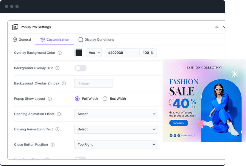
In this tab, you have complete control over your Popup’s appearance and functionality. You can adjust the overlay, animation, positioning, blur effect, and even the close button.
The close button can be hidden or placed inside the popup on certain devices.
To create a visually stunning design, you can customize the close button’s color, background, position, icon size, padding, margin, and border-radius.
These settings empower you to design a beautiful and user-friendly popup that suits your website’s style and user experience.
Display Tab Settings
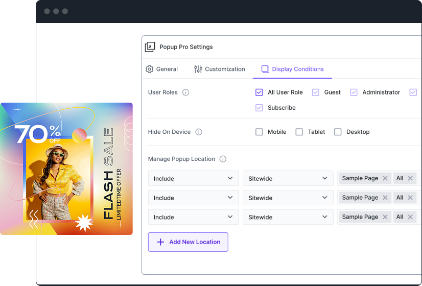
In the user role, the Popup extension offers precise control over which user roles can access and view the Popup content on a website.
Here, you can configure Popup display settings. You can specify Popup visibility by user role. Define the display area, including/excluding specific pages, posts, projects, or Popups.


